JRA
I worked for many years as a Design Specialist and Marketing Manager for Johnson Roberts Associates (JRA), an architecture firm focusing on public and community-based projects. During my time there, I engaged in a number of design projects, from client presentations and proposals, to marketing collateral and portfolio books. Over the course of my tenure, I helped JRA adapt to changing business goals as they adapted to new markets.
Role
Web Design, Marketing, Branding
Presenting the Firm
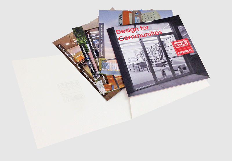
As Marketing Manager, I was in charge of both creating compelling project proposals for prospective clients and representing the firm through a variety of digital and physical channels. Over time, I helped hone a consistent visual look for the firm that was polished but friendly, projecting the firm's expertise in community-focused projects.
Repositioning the Brand
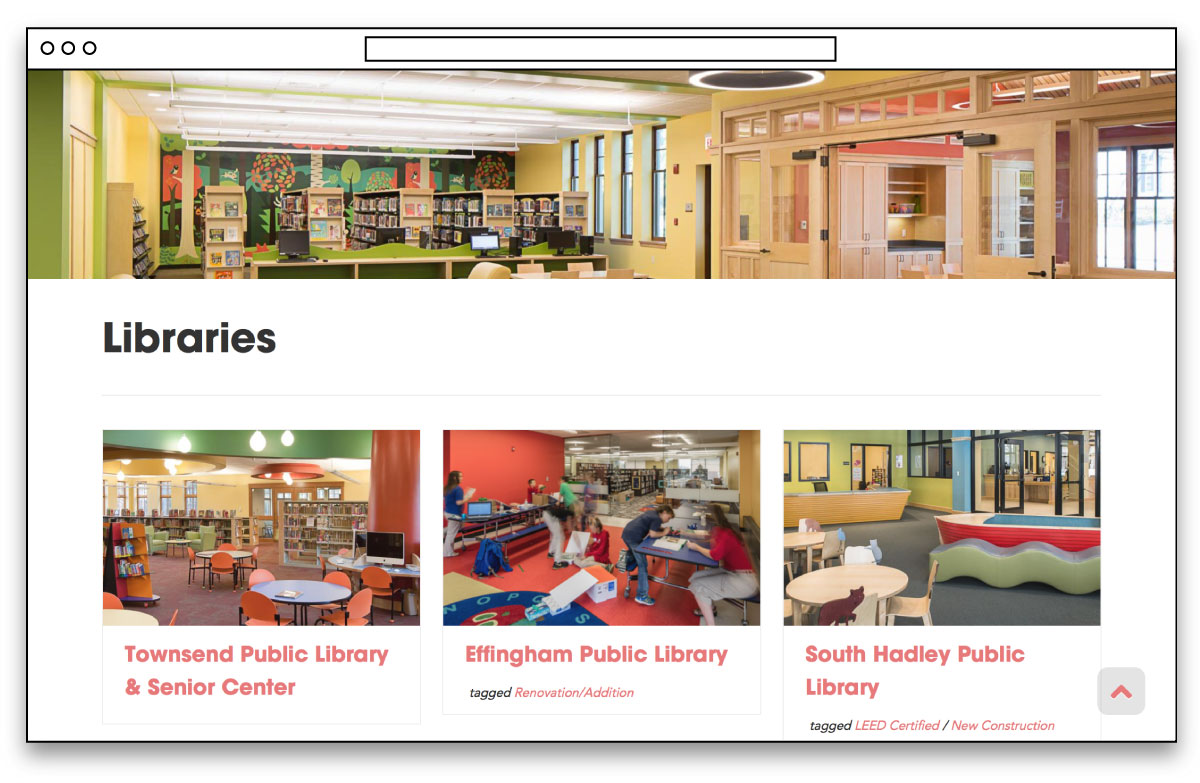
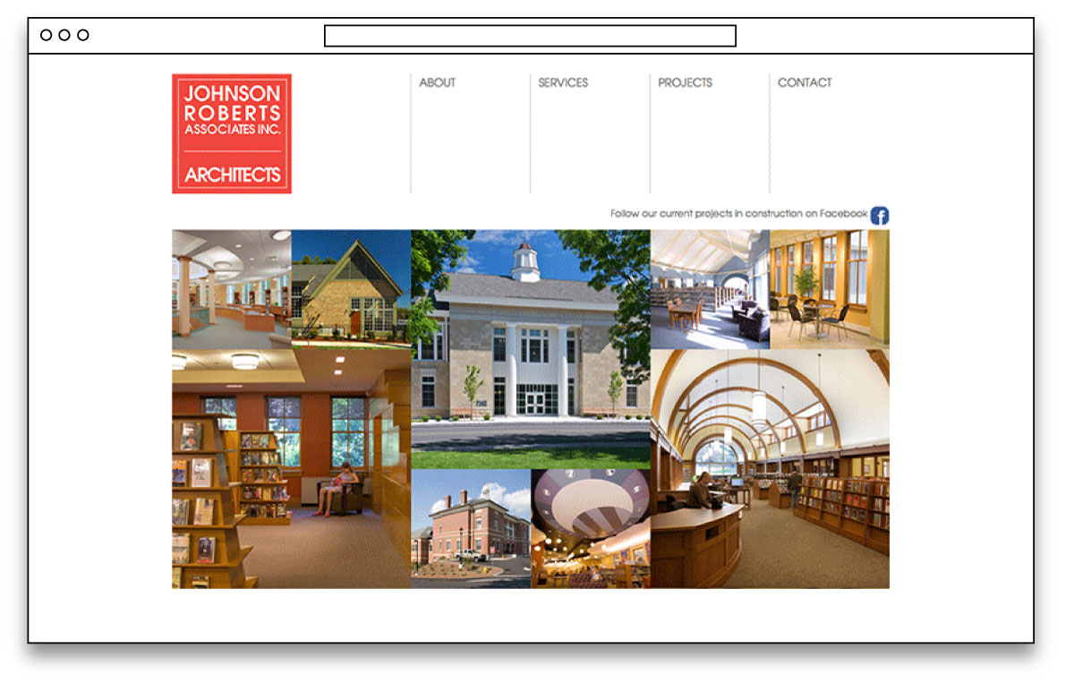
Early on in my tenure, I took the firm’s existing site and completely changed the back-end experience, restructuring it to operate on a CMS for easy updating, and significantly building out the database of completed projects showcased. After several years, it became clear that larger aesthetic changes were needed to both better accommodate the mobile experience of visitors and to align with changing business development goals in the firm.
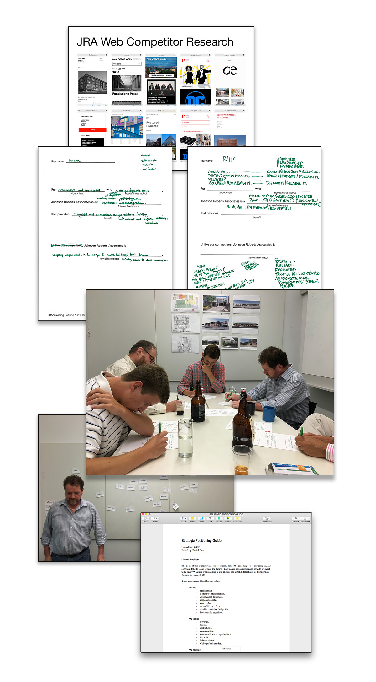
The firm had been expanding into a new market sector, PreK-12 educational spaces, and needed to figure out how to cohesively present an increasingly diverse body of work. As part of the website redesign process, I conducted a series of internal workshops to build consensus around the identity of the firm and how it hoped to be perceived by prospective clients. These workshops included collaboratively building a market position statement that clearly assessed points of differentiation from other firms. Additionally, a “personality card” exercise gave oppositional adjectives—“experimental” versus “traditional”, for example—and asked team members to sort through what the firm strongly identified with or dis-identified with. Competitor research led to a “gut check” on visual tone and project presentation styles.
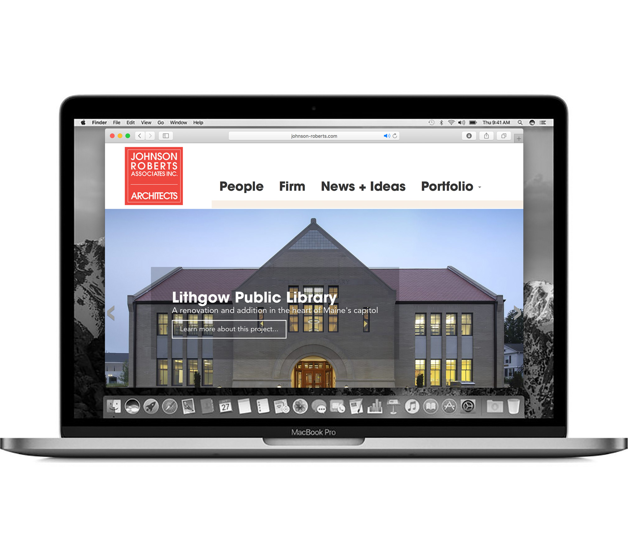
A New Digital Face
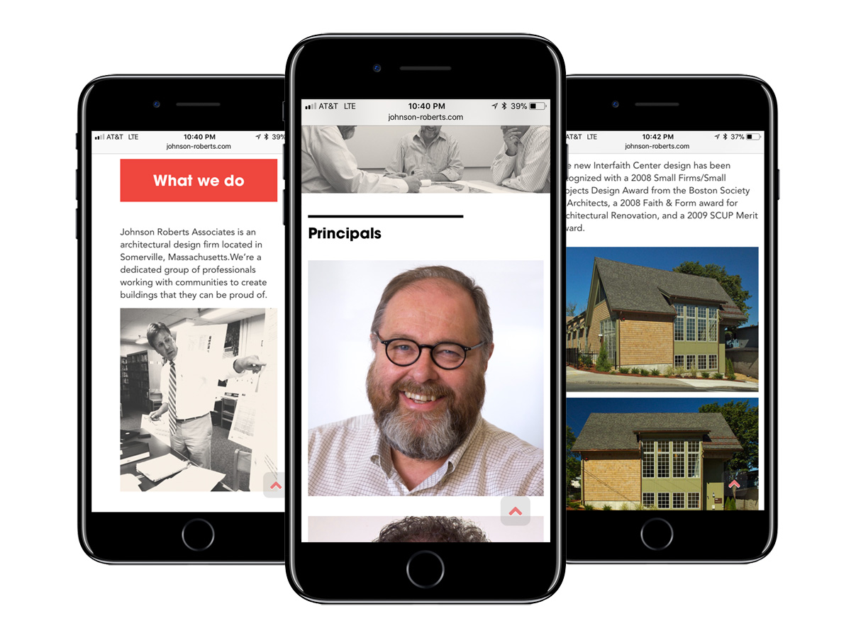
As a result of these workshops, it became clear that the firm needed to emphasize the community-building thread that ran through all of its project, regardless of sector. Bold, large-scale images of projects that involved meeting and collaboration spaces that could be applicable to any project type were emphasized. Additionally, as a small-scale company, the personal relationships and attention given by the firm’s Principals was identified as a major point of differentiation. Images of staff were emphasized and expanded biographies given, opening a window into the firm’s personality and working process that could appeal to potential clients and prospective employees alike. The entire site was built on an updated WordPress platform and provides a seamless experience between desktop views.
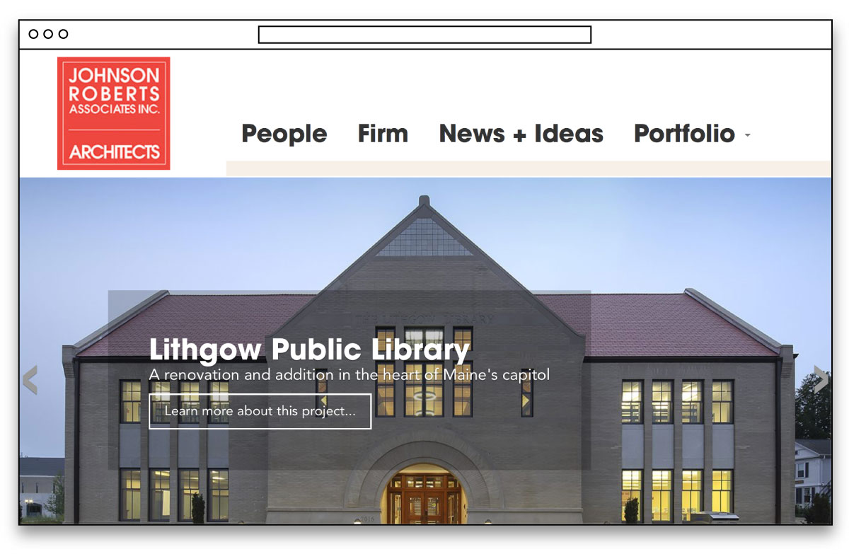
The information architecture of the website was streamlined to direct visitors more clearly to their destinations. Based on analytics, pages that were more frequently visited became highlighted at the top of the page, while redundant pages like a separate "Contact" area became embedded in the footer of the site.
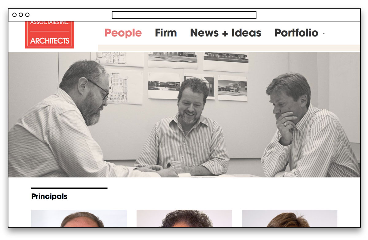
New photographs were taken of the staff at work and integrated into explanations of the firm's working process and staff biography pages.
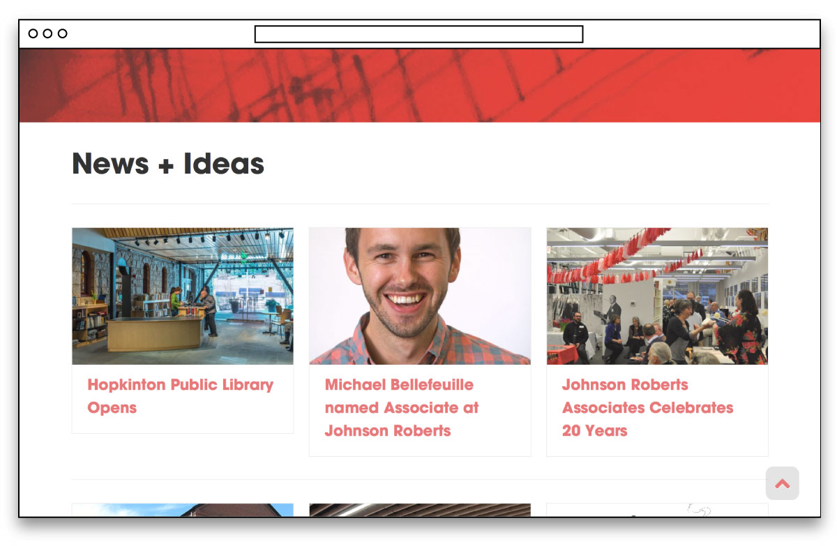
The "News" section of the previous site was renamed "News + Ideas," giving a platform for writing by staff members on a broad variety of topics related to architectural design. The firm had several initiatives, including the annual roundtable event "Library:Next," which were not being featured anywhere. This new platform allows the firm to communicate its status as thought-leader for the industry and demonstrate progressive thinking to potential clients.